It’s pretty hacky, but it works and it doesn’t have limited browser support, unlike clip-path.
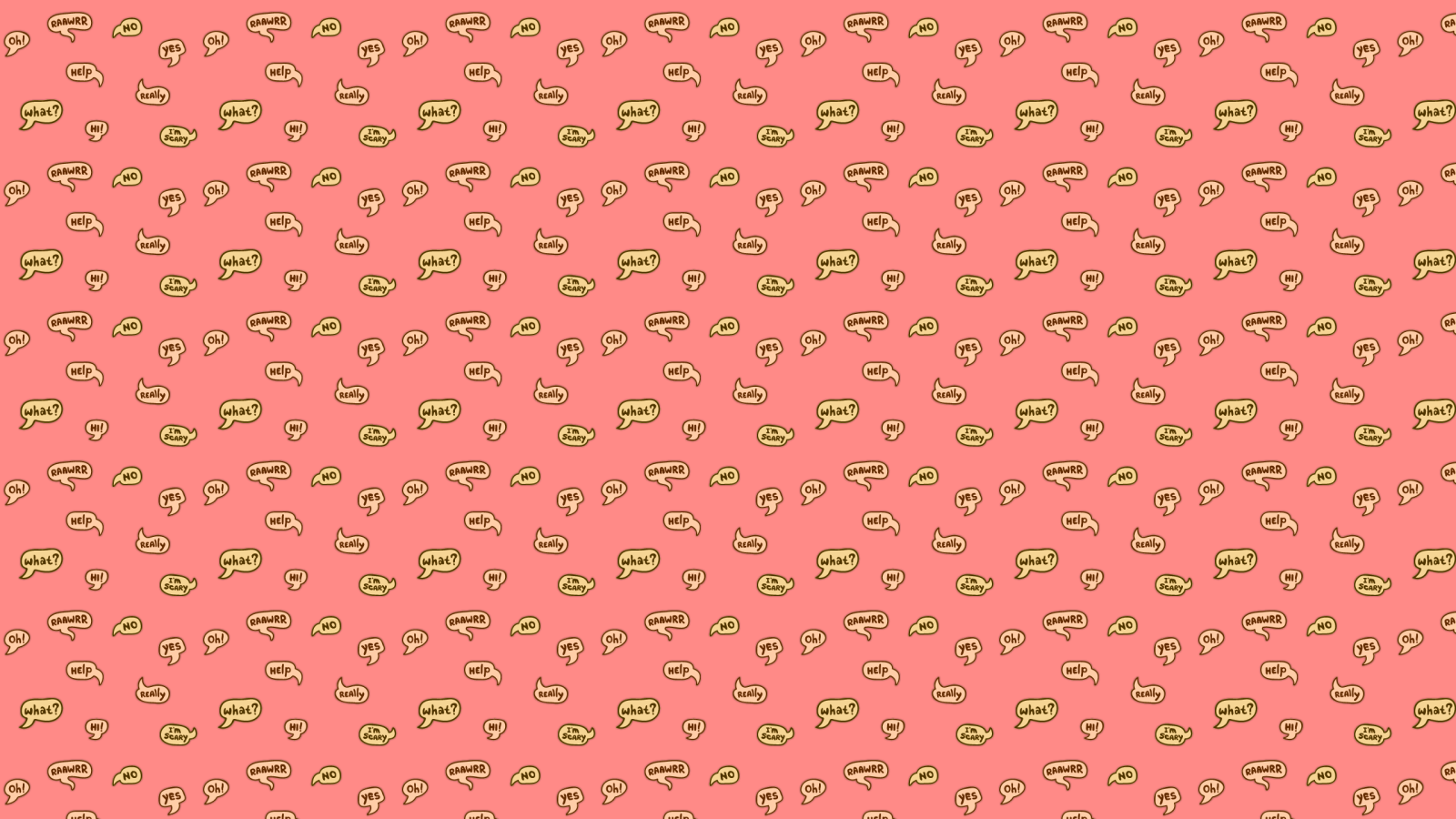
The typical way to do this is simple — use the container’s :before or :after pseudo-element to create a CSS triangle, and attach it to the appropriate edge.
Like so:
You see the problem, don’t you? The arrow is dangling off the edge of the bubble, sure enough, but it looks woefully out of place with its solid color. It can look much nicer than that with some trickery.
The typical speech bubble arrow effect is created by adding an element; in our previous example, a single pseudo-element with a border hack.
What we’re going to do is also a border hack. But instead of adding an element, we’re going to create the illusion of taking something away.
The containing element and the content wrapper are the same as in the first example. But the background isn’t full width; we’re going to pull it farther out — ten pixels for this example, but you want to pull it out exactly the width of your arrow.
The trick here is to use the background element’s :before and :after pseudo-elements to overlay that extended area. We’re essentially going to carve out the shape of our arrow.
Here is an example with different colors for each of the borders, which allows you to see the shape we’re going to make.
We’ll make the left, top, and bottom border colors transparent, creating the outline of the arrow, and the right border will need to match the background of the element containing the speech bubble. That’s important, or the effect is lost.
So here is the final result:


Leave a Reply